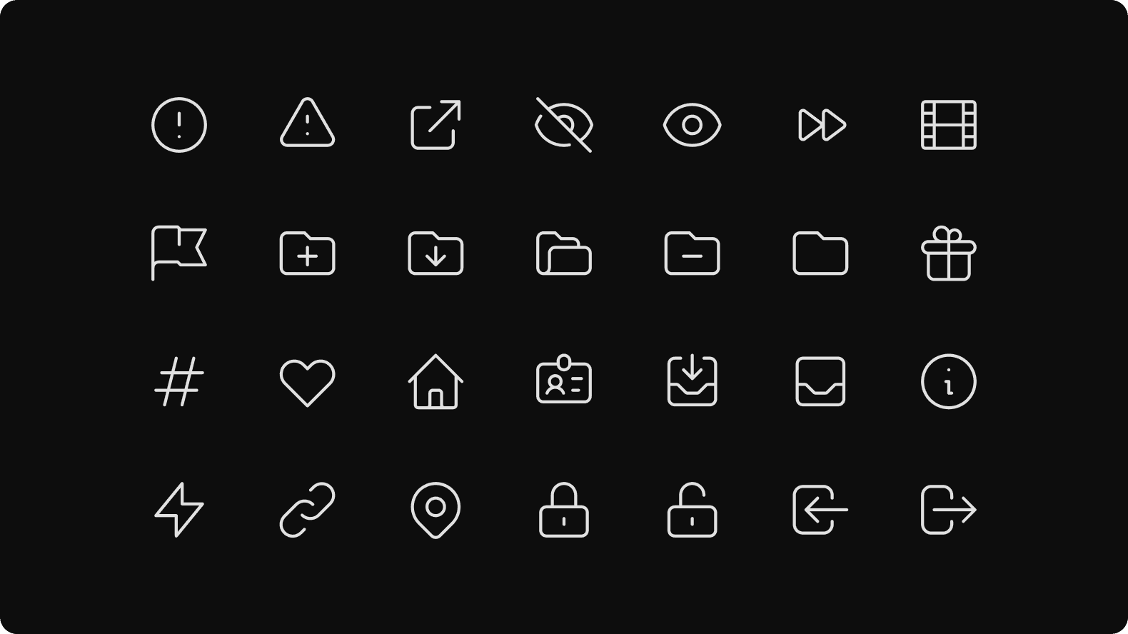
Our icons are designed and engineered to be readable in small sizes.
Icon style
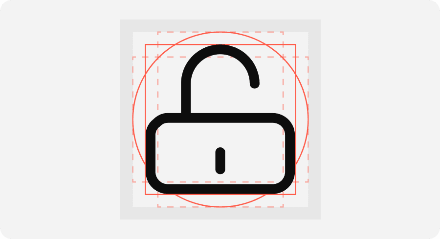
Our icons are formed by the combination of rounded corners and outline. They should feel soft and smooth.
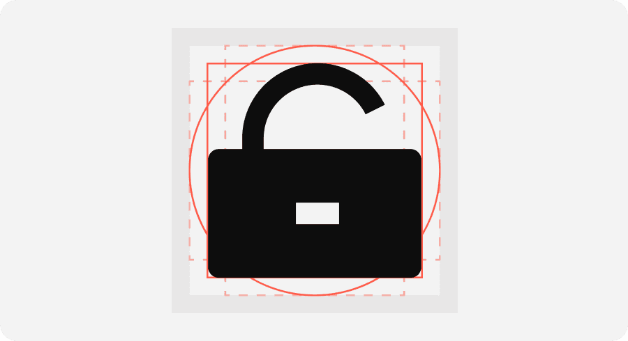
Incorrect usage
Example of how not to use icons. They should not look sharp, aggressive, or heavy with fill.
Do not use icons with square corners and filled shapes.


